Subpopulation FPR / TPR
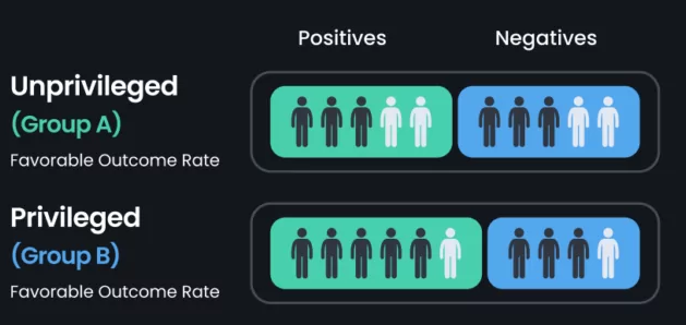
To assess fairness on your predictions, is a good idea to compute the False Positive Rate (FPR) and True Positive Rate (TPR) for different subgroups, if your model is fair, FPR and TPR must be very simmilar among subgroups. This fairness metric is also known as equality of odds. You can get here more information about this fairness metric.
Let's use CreditScore dataset to compute FPR and TPR over man and woman. This dataset gathers personal data from different customers, in order to say if a given customer will default to pay a credit.
Let's say we train an ensemblist predictor and this is the output, the prediction is stored on Prediction column.
Now we want to know how fair is this ensemble predictor is performing using FPR and TPR metrics. We can actually do it very easily and quickly with Kafkanator. First the imports :
import matplotlib.pyplot as plt
import pandas as pd
from sklearn.metrics import confusion_matrix

from kafkanator.fairness import fpr_fnr
from kafkanator.util import categorize_interval,rename_column
We will use the fpr_fnr function along with utility functions categorize_interval and rename_column whose main objective is to rename numerical values into string for visualization purposes (next sprint):
df2 =  pd.read_csv('ensemblist.csv')

df2['SEX'] = rename_column(df2,'SEX',{1:"male",2:"female"})
df2['MARRIAGE'] = rename_column(df2,'MARRIAGE',{1:"married",2:"single",3:"others"})
df2["AGE"] = interval_categorize(df2, "AGE", { 'young':(20,30) , 'adult':(31,50), 'elder': (51,70)  })
rename_column changes the numerical values 1,2,3 for string descriptions in order to make easier the visualization part. interval_categorize is a helpful method that collapse numerical values into intervals and assign labels to make easier the manipulation of high diversity metrics such as age. You define a dictionary containing labels and intervals (for example { 'young':(20,30) , 'adult':(31,50), 'elder': (51,70) } ) and kafkanator will perform the renaming for you . This step is only needed if you want to get more meaningful visualizations. Your dataset will be transformed from table 1 to table below :
| ... | SEX | EDUCATION | MARRIAGE | AGE | ... |
|---|---|---|---|---|---|
| ... | female | 2 | married | young | ... |
| ... | female | 2 | single | young | ... |
| ... | female | 2 | single | adult | ... |
| ... | female | 2 | married | adult | ... |
| ... | male | 2 | married | elder | ... |
Once you have your table like you want you can launch the fpr_fnr function :
d1=fpr_fnr(df2,'SEX')
d2=fpr_fnr(df2,'MARRIAGE')
d3=fpr_fnr(df2,'AGE')
print ( ' FALSE POSITIVE AND NEGATIVE RATES :  ', d1 , ' ', d2 , ' ', d3)
The print command will output :
{'female': 0.040474528960223306, 'male': 0.05430316490838423}, {'female': 0.6341398564211645, 'male': 0.6012547926106657}) ({'others': 0.06944444444444445, 'single': 0.046648155493851644, 'married': 0.0441486305305497}, {'others': 0.6404494382022472, 'single': 0.620059880239521, 'married': 0.619181505779444}) ({'elder': 0.06480380499405469, 'young': 0.05289081740354169, None: '', 'adult': 0.03880756328148826}, {'elder': 0.5786713286713286, 'young': 0.5931174089068826, None: '', 'adult': 0.6452693273792911}
According to this numbers, there is no significant gap in FPR nor FNR between female and male nor single or married. however there is a slightly bias on adults on FPR ( 0.03 vs 0.05 and 0.06 ).[TO BE REVIEWED].
