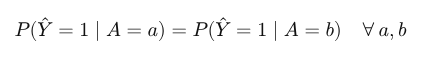
Statistical Parity

Statistical parity is a fairness measure to assess how a given predictor behaves when applied in groups having different sensitive attributes. Statistical parity helps answering the question: what is the output of my predictor when the value of my sensitive attribute is something (for example man ) compared to another value of my sensitive attribute (for example women ) ?.
In Kafkanator, you can use statistical_parity method, on fairness package.
With this method, you can easily visualize if there is a bias in predictions of a given model when applied to a specific group.
Let's use this method on the well known COMPAS algorithm.
In 2016, Propublica, an independent journalism media, show that this algorithm used to assess reicidivisdm in jails of US was racially biased. Let's confirm or reject this statement with a graphical argument using Kafkanator.
You can find here the COMPAS model output dataset: from a set of predictors that you can inspect in dataset, it assigns a probability (Low,Medium,High) for a defendant to commit a crime again.
Let's visualize quickly and easily biases in COMPAS predictions by using Kafkanator: We will do it in two times, first build a synthesis table with fit_data method. COMPASS prediction is in ScoreText column and EthnicCodeText is the sensitive attribute. Don't forget to download the code here after this you can create a jupyter notebook at the side of the downloaded folder and paste this code :
import pandas as pd
from kafkanator.fairness import statistical_parity_data
df = pd.read_csv('/home/jsaray/Documentos/datascience/archive/compas-scores-raw.csv')
table = statistical_parity_data(df,'Ethnic_Code_Text','ScoreText')
filtered_table = table[(table["attr"] == "Hispanic") | (table["attr"] == "African-American") | (table["attr"] == "Caucasian") ]
Lets inspect table variable, you should see something like this :
| Sensitive Attribute | Prediction | Number |
|---|---|---|
| Hispanic | Low | 6963 |
| Hispanic | High | 473 |
| Hispanic | Medium | 1297 |
| Other | Low | 2169 |
| Other | High | 89 |
Once we have this table, we can use our preferred python visualization toolkit ( for instance seaborn ) to build our statistical parity visualization. The natural way to visualize this, is by grouped bar plots. Seaborn provide a very nice, easy and confortable way of visualization :
sns.catplot(x="prediction", y="number",hue="prediction", col="attr",data=filtered_table, kind="bar",height=4, aspect=.7)
You should see something like this :
As concluded by researchers, we see that COMPAS predictions are biased w.r.t race (african americans are most prone to be tagged as high risk of recommiting a crime).
